Thursday, December 16, 2010
Tuesday, December 14, 2010
Final Artist: THREE
Final Artist: TWO

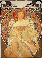
Alphonse Mucha:
Monday, December 13, 2010
My Three Artists : ONE

Friday, November 26, 2010
Illumination
Artist 6: Stina Persson
Artist 5: Jason Thielke
Artist 4: Heike Weber
Artist 3: Andreas Preis
Artist 2: Mucha
Artist 1: Mondrian
Monday, November 8, 2010
Sunday, November 7, 2010
Palatino

We began a project focusing on a specific font and analyzing its characters to determine those that are most distinguishing. Once we've gathered information for our fonts, we design a series of posters that display the information in a clear, organized way that is visually engaging and demonstrates a strong hierarchy. This image is an example of the most basic way to present the entire Palatino font.
Motion Graphics
Looking forward to similar projects in the future.
Wednesday, October 13, 2010
Hermann Zapf’s Palatino
The Renaissance was a cultural movement that spanned roughly the 14th to the 17th century, beginning in Florence in the Late Middle Ages and later spreading to the rest of Europe. The term is also used more loosely to refer to the historic era, but since the changes of the Renaissance were not uniform across Europe, this is a general use of the term. As a cultural movement, it encompassed a resurgence of learning based on classical sources, the development of linear perspective in painting, and gradual but widespread educational reform. Traditionally, this intellectual transformation has resulted in the Renaissance being viewed as a bridge between the Middle Ages and the Modern era. Although the Renaissance saw revolutions in many intellectual pursuits, as well as social and political upheaval, it is perhaps best known for its artistic developments and the contributions of such polymaths as Leonardo da Vinci and Michelangelo, who inspired the term "Renaissance man."
The paintings of the Italian Renaissance differed from those of the Northern Renaissance. Italian Renaissance artists were among the first to paint secular scenes, breaking away from the purely religious art of medieval painters. At first, Northern Renaissance artists remained focused on religious subjects, such as the contemporary religious upheaval portrayed by Albrecht Dürer. Later on, the works of Pieter Bruegel influenced artists to paint scenes of daily life rather than religious or classical themes. It was also during the northern Renaissance that Flemish brothers Hubert and Jan van Eyck perfected the oil painting technique, which enabled artists to produce strong colors on a hard surface that could survive for centuries.
Medieval and Renaissance issues of design and typography have influenced many modern time typographers and book designers. They trace back to the characteristics and styles that represented the Renaissance and Medieval time period. The Renaissance* was typified by an obsession with things "classical,"* in the Greco-Roman* sense, which had major implications for typography. The neo-classical letterforms were somewhat more condensed than the Carolingian shapes, but much rounder and more expanded than the blackletter.
Named after 16th century Italian master of calligraphy Giambattista Palatino, Palatino is based on the humanist fonts of the Italian Renaissance, which mirror the letters formed by a broad nib pen; this gives a calligraphic grace. But where the Renaissance faces tend to use smaller letters with longer vertical lines (ascenders and descenders) with lighter strokes, Palatino has larger proportions, and is considered to be a much easier to read typeface. This font was released in Germany in nineteen-fifteen and was distributed by Linotype.
It remains one of the most widely-used (and copied) text typefaces, has been adapted to virtually every type of technology, and is one of the ten most used serif typefaces.
Palatino Linotype : In 1999, Zapf revised Palatino for Linotype and Microsoft, called Palatino Linotype. This is a version of the Palatino family that incorporates extended Latin, Greek, Cyrillic characters, as well as currency signs, subscripts and superscripts, and fractions. The family includes roman and italic in text and bold weights. It is one of the few fonts to incorporate an interrobang.
Under the collaboration of Zapf and Akira Kobayashi, the Palatino typeface family was expanded. Linotype released the Palatino nova, Palatino Sans, and Palatino Sans Informal families, expanding the Palatino typeface families to include humanist sans-serif typefaces. Palatino nova was released in 2005, while the others were released in 2006. Palatino nova is a redesigned version of this type, created by Hermann Zapf and Akira Kobayashi. This Palatino nova typeface family includes roman and italics in the light, text, medium, and bold weights, a titling face formerly called Michelangelo Titling, and a large and small capital face called Palatino nova Imperial formerly called Sistina.
The Palatino font is considered to be a member of the Old Style, also referred to the Gerald, classification of typefaces. Old style type is a style of font developed by Renaissance typographers to replace the Blackletter style of type and is generally considered "warm" or friendly, thanks to its origins in Renaissance humanism, though it was also influenced in part by Roman inscriptions. Other fonts that fall under this same classification are Bembo, Caslon, Garamond, and Jenson. Each of these meets the same criteria and were all heavily inspired by handwriting, especially of the Renaissance era.
Old style types, although they owe much to the same roots as the typical Humanistic typefaces, show a marked departure from simply mimicking the handwriting of earlier Italian scholars and scribes. It’s from this period, that we can really see type getting into gear. It’s certainly one of the most exciting periods in type history. The Old Style (or Gerald) types start to demonstrate a greater refinement—to a large extent augmented by the steadily improving skills of punchcutters.
The main characteristics of old style typefaces are low contrast with diagonal stress, and cove or "bracketed" serifs (serifs with a rounded join to the stem of the letter). The roman typefaces of the fifteenth and sixteenth centuries emulated classical calligraphy. Sabon was designed by Jan Tschichold in 1966, based on the sixteenth-century typefaces of Claude Garamond. Fonts that fall under this classification have a contrast between the thick and thin strokes that is more pronounced, a shorter “x-height,” and serifs that are described as “sturdy without being heavy.”
Italics at this point were still independent designs, and were generally used completely separately; a whole book could be set in italics. Probably the most famous italic of the period is Arrighi's (1524), which may be seen today as the italic form of Centaur. Likewise, the italic form of Bembo is based on the italic of Tagliente (also 1524). Later or baroque old style type (17th Century) generally has more contrast, with a somewhat variable axis, and more slope of italic. The most common examples are the types of Caslon and Garamond.
Palatino: The designer
German typeface designer Hermann Zapf, who also created Optima, designed Palatino. It was initially released in 1948 by the Linotype foundry. is a German typeface designer who lives in Darmstadt, Germany. He is married to calligrapher and typeface designer Gudrun Zapf von Hesse. He was born in Nuremberg, into turbulent times, marked by the German Revolution in Munich and Berlin, the end of World War I, the exile of Kaiser Wilhelm, and the establishment of Bavaria as a free state by Kurt Eisner. In addition, the Spanish Flu Pandemic took hold of Europe in 1918 and 1919 and killed two of Zapf's siblings. Famine later struck Germany, and Zapf's mother was grateful to send him to school in 1925, where he received daily meals in a program organized by Herbert Hoover. In school, Zapf was mainly interested in technical subjects.
Zapf was not able to attend the Ohm Technical Institute in Nuremberg, due to the new political regime. Therefore, he needed to find an apprenticeship. His teachers, aware of the new political difficulties, noticed Zapf's skill in drawing and suggested that he become a lithographer. Each company that interviewed him for an apprenticeship would ask him political questions, and every time he was interviewed, he was complimented on his work but was rejected. Ten months later, in 1934, he was interviewed by the last company in the telephone directory, and the company did not ask any political questions. They also complimented Zapf's work, but did not do lithography and did not need an apprentice lithographer. However, they allowed him to become a retoucher, and Zapf began his four-year apprenticeship in February 1934.
In 1935, Zapf attended an exhibition in Nuremberg in honor of the late typographer Rudolf Koch. This exhibition gave him his first interest in lettering. Zapf bought two books there, using them to teach himself calligraphy. He also studied examples of calligraphy in the Nuremberg city library. Soon, his master noticed his expertise in calligraphy, and Zapf's work shifted to lettering retouching and improvement of his colleagues' retouching work.
Zapf designed types for various stages of printing technology, including hot metal composition, phototypesetting (also called "cold type"), and finally digital typography for use in desktop publishing. His two most famous typefaces, Palatino and Optima, were designed in 1948 and 1952, respectively. Palatino was designed in conjunction with August Rosenberger, with careful attention to detail. It was named after 16th century Italian writing master Giambattista Palatino. Optima, a flared sans-serif, was released by Stempel in 1958. Zapf disliked its name, which was invented by the marketers at Stempel.
Zapf’s work has been widely copied, often against his will. The best known example may be Monotype's Book Antiqua, which shipped with Microsoft Office and was widely considered a "knockoff" of Palatino. In 1993, Zapf resigned from ATypI (Association Typographique Internationale) over what he viewed as its hypocritical attitude toward unauthorized copying by prominent ATypI members.
Zapf also designed Aldus, which appeared in the D. Stempel AG catalog in 1954. Both Aldus and Palatino were Zapf’s new form of old style typefaces inspired by the Renaissance. Originally intended as the book or text weight for Zapf's Palatino font family, it was instead released as a separate family.
Other types by this designer:
AMS Euler
Aurelia
Edison
Hunt Roman
Kompakt
Marconi
Medici Script
Melior
Mechelangelo
Noris Script
Optima
Orion
Saphir
Sistina
URW Antiqua
URW Grotesk
Vario
Venture
Zaft Essentials
Zaft Renaissance Antiqua
Zapfino
Zapfino Extra
Bibliography
Bringhurst, Robert (2005). The Elements of Typographic Style. H&M Publishers. p. 223.
"History of Typography: Old Style." I Love Typography. 21 Nov. 2007. Web. 04 Oct. 2010.
"Identifont - Hermann Zapf." Identifont. David Johnson-Davies, 2009. Web. 04 Oct. 2010.
"Typedia: Palatino." Typedia: A Shared Encyclopedia of Typefaces. Discovery Media, 2010. Web. 04 Oct. 2010.
Zapf, Hermann. Alphabet Stories: a Chronicle of Technical Developments. 2nd ed. Rochester, NY: RIT Cary Art Graphics, 2007. Print.
Sunday, October 10, 2010
Wednesday, September 29, 2010
Monday, September 27, 2010
Wednesday, September 8, 2010
Frutiger
From what I’ve come to learn through articles about Adrian Frutiger, it is safe to say that he has been one of the most influential type-designers of the twentieth and twenty-first centuries. Beginning his work at only the age of sixteen as a student Switzerland, this designer’s ideas were far ahead of his time. Frutiger valued the beauty in simplicity and believed that only the most legible typefaces would be the most successful. He was right. Being a designer from the 1920’s, he predicted the rapid technological evolution and designed fonts that could be applicable to future inventions. A select number of the typefaces Frutiger created are still existent and commonly used in this modern world, such as Univers and Frutiger. It is from these type designs that the artist achieved his status as a great type designer. Throughout his career, Frutiger wrote a series of books while developing designs, each regarding type. These books are often referenced and are still viewed as important influential resources for designers today.
Since the late 1990’s Frutiger has been working collaboratively with Linotype designers on expanding and refining the font families of some of his most popular typefaces. He is constantly developing his work in order to keep it up to date with modern times. In conclusion, Adrian Frutiger’s career has spaned for over sixty years and has drastically impacted the field of design.


